How to use Reference Lines in Table Calculations in Tableau
How to use Reference
Lines in Table Calculations
- In this example, we can see how to use Table Calculations with Logical calculations.
- Let’s start with finding out which ‘Category’ is reaching ‘Average Sales’ in each ‘State’. The Sales which cross the Average sales should show one color, say Blue and the Sales which do not reach the Average sales should show Orange color. Sample Superstore database and Tableau 10.3 is used.
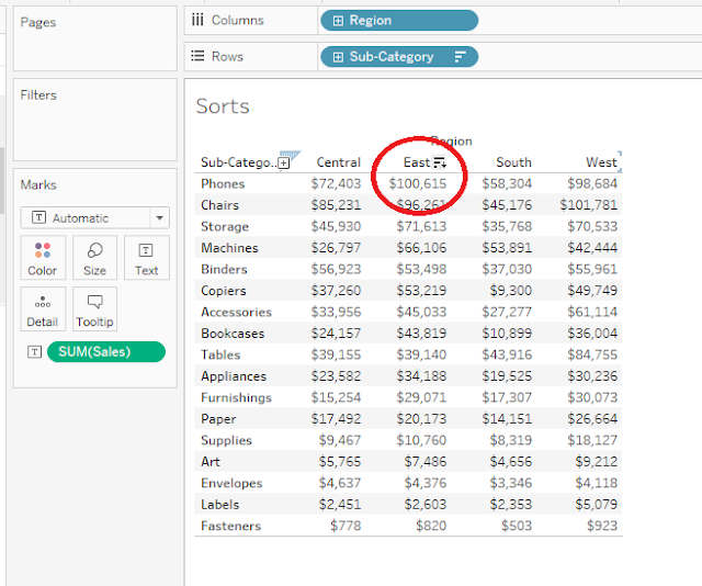
- Pull Sales onto Columns and State, Category in Rows.
- Add a ‘Reference Line’. We can add it
two ways. Use the Reference Line option from ‘Analytics Pane’ or Right click
the ‘Sales axis’ and use option ‘Add Reference Line’. We can have multiple Reference lines
in a single dashboard.
- To get different colors for the Sales which reach the Average and which do not, create a Calculated field, name it ‘Sales KPI’ (Key potential Indicator) and give the formula as ‘Sum(Sales) > Window_Avg(Sum[Sales])’.
- To know more about ‘Window functions’, if you take reference line across ‘pane’, each pane is considered as ‘each window’. (Here we have to compare each individual category sales with Category Sales(Avg) in each State).
- If you take reference line across ‘Table’, entire table is considered ‘one window’. (Here we have to compare each individual category sales with entire Category Sales(Avg) across the table).
- Pull the formula Sales KPI, onto colors and edit the colors for True to Blue and False values to Orange. Now the values satisfying the True Condition are in blue color and the values in False are in Orange.
- There are three options on how to use the reference line Table, Pane and Cell.
- If you Pull the Reference Line on ‘Table’,
this shows the ‘Average of Sales’ for the ‘whole table’. We can even format the
Lines, Fill Above and Fill Below with different colors to enhance the usability
of Dashboard as in Fig below.

- If you pull it on ‘Pane’, it will
show the Average of Sales for the individual pane, which is State in this
example. To get this, change the ‘Compute Using’ from ‘Table (down)’ to ‘Pane (down)’
in ‘Sales KPI’ in ‘Marks section’ as in fig below.

- If you pull Reference Line on ‘Cell’, it will
give average of sales on each Cell, which is category here. Pulling it on the
on Cell, i.e. Category doesn’t make any sense here as the both will give the
same number Sum(Sales) and Avg(Sales). But it will be useful in few scenarios
where you want to check the ‘Average Profit’ for each ‘Sales’ cell. For this,
pull the Profit on ‘Details’ component of ‘Marks’ card. Add a reference Line on
Cell. Choose Sum(Profit) in Value,
Aggregation to Average, Label to Value and do the necessary formatting. You can
see the Average Profit for individual Sales for each category in each state as
shown in fig below.


Simple and clear
ReplyDelete