Posts

Types of Sorts

Image
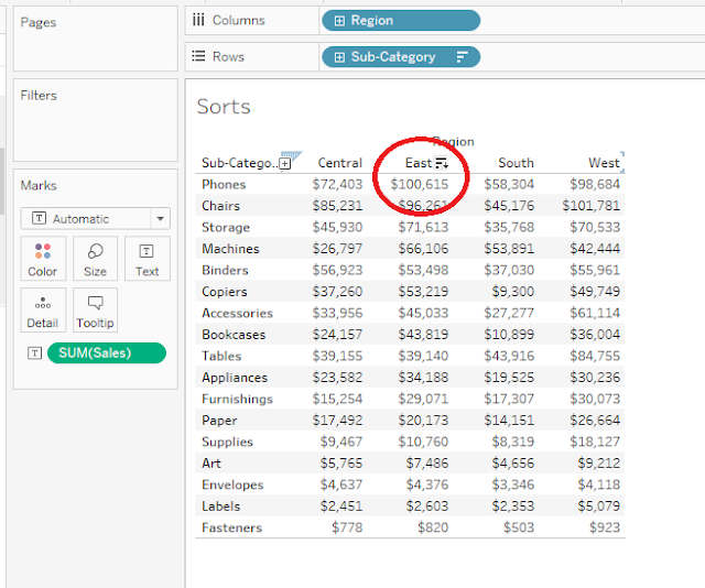
Sorts Sorts are of different types, 1.      Simple Sort 2.      Complex sorts 3.      Advanced Sort using Calculated field 1.      Simple Sort ·        Pull Region onto Columns, Sub-Category onto Rows and Sales on the Text on Marks card. Database used is Sample Superstore and Tableau 10.3. ·        We can find the highest ‘Sales’ in each ‘Region’ by clicking on the ‘Sort’ Button beside each Region. Here the Sub-category ‘Phones’ has the ‘highest Sales’ in ‘East Region’. ·        Note: The default sort type is Descending. ·        We can sort the Sub-Category too, it will be ascending and Descending according to alphabetical order. ·        We can also sort the Sales ‘Row-Wise’, this give the sales from high to low Sales for that particular Sub-Category. ·        Now Pull Category onto Rows, Click on the Category, goto Sort, we can see the window as shown in the below pic. We have options for Sort Order Ascending, Descending. ·        Sort By : Da

When to use Histograms

Image
HISTOGRAMS Histograms is a chart where we can show data in chunks. Data is divided into bins.  Example in healthcare, we can have patients with their age in bins and analyze the data using histograms such that we can find which group of patients are visited more often in that hospital and in what time of day. Note: bins can only be created on Measures. It can’t be created on measures. Example: Create a Bins on Sales with a bin size of 1000. Right Click on Sales, Select Create, Select Bins. Pull Sales(bin) onto Columns and Sum(Sales) onto rows. We can analyze the data here, the first Bin(0-1000)sales are making 1.3M sales, next bin(1000-2000) are making 450k Sales. The Bins with 14kto 16k doesn’t have sales at all.

When to use Cloud Words in Tableau

Image
Cloud Words   We use Cloud words to analyze the data easily just by looking at the size and color on the text.   Pull ‘Sub-Category’ on ‘Text’ and ‘Sales’ on ‘Color’ on the ‘Marks’ Card. The darker color on the text represents higher sales. Database used is Sample Super Store and Tableau 10.3.   Now, let’s go more creative and pull ‘Sales’ from ‘Color’ onto Size’ and change the Mark Type from ‘Box’ to ‘Text’. Pull ‘Profit’ onto ‘Color’ as show in below pic.   We can analyze the data here just by looking at the text, Phones has the highest sales and Profits as it is the biggest in size and darkest in color. Tables has the lowest Profit even though the Sales are higher, Fasteners have low Profits and Sales.   Based on this information the management can take a decision as to increase the product of particular categories or stop those services.

When to use Bump Charts in Tableau

Image
Bump Charts When to use Bump Charts: Bump Charts helps us to assign Ranks to various Dimensions across the Time series. Here, let’s find the Ranks of each individual Region in each cumulative Month. Database used is Sample Super Store. Pull Month (Order date) (cumulative) onto Columns and Region on Colors on Marks card. Create a Calculated Field, name it Rank and give the formula as Index(). Right Click on the Rank, Convert it from Continuous to Discrete. Pull the Rank onto Rows. Change the Mark type from Box to Line. We can see 12 Ranks now as there are 12 months. Click on ‘Ranks’ on the rows, Go to ‘Edit Table Calculations’. In Compute Using, Select Specific Dimensions.   Select Month of Order date, Region. In ‘At the level’, select ‘Region’, at ‘Restarting Every’ Select ‘Month of Order date’, at ‘Sort Order’ choose Custom, Select ‘Profit’, aggregation to ‘Sum’, and Sort order ‘Descending’. This gives the Ranks such that, in which particular Month, which Re

Where to use Box Plots in Tableau

Image
Box Plots   We use Box plots to analyze how data is spread across the data set.   Every set can be divided into 3 quartiles. Q1 =0-25%(Lower Quartile), Q2 = 25-50% (Median), Q3=50-75%(Upper Quartile)   In this example, Pull Sub- Category onto Columns and Sum(Profit) onto rows. Database used is Sample Superstore and Tableau 10.3.   Change the marks type from line to Circle. we can see the profit of each sub-Category.   Now pull the State onto details, we can see the distribution of Profit different states. We can format by increasing the transparency of the circle and the borders for the circle to better dentify the data. Sort the data, such that it shows highest to least.   Right click on the Profit Axis, Add Reference Line, Select Box Plots.   Give the Plot Options as ‘Data Within 1.5 times the IQR’. The data will spread as in the below pic. Format the necessary, Select Hide Underlying Marks (expect Outliers), Style, Fill, Modern, Borders, Whiskers as in

Types of Groups

Image
Types of Groups      Pull ‘Sales’ onto Columns, ‘Sub-Category’ on Rows. Database used is Sample Super Store and Tableau 10.3 Let’s Create a group of Sub-Categories which are performing low. ·        Click on Control, Select ‘Art, Envelopes, Fasteners, Labels and Supplies’. Release the Control and you can see the ‘Paperclip’ Icon. Click on it, a new group is created. You can name it as ‘Small Offices’, using ‘Edit Alias’ (Right Click on the group) ·      Note: Creating a group brings down the performance of the dashboard as it increases the redundancy of the data.    You can observe that ‘Sub- category (group)’ is created even though there is Sub-Category field. This duplicates the data and reduces the performance highly. ·        Note:  Difference between Groups and Sets: Groups can be created on both Measures and Dimensions whereas Sets can only be created on Dimensions. Sets are specifically designed to understand the nature and pattern of the

How to use Reference Lines in Table Calculations in Tableau

Image
How to use Reference Lines in Table Calculations    In this example, we can see how to use Table Calculations with Logical calculations.   Let’s start with finding out which ‘Category’ is reaching ‘Average Sales’ in each ‘State’. The Sales which cross the Average sales should show one color, say Blue and the Sales which do not reach the Average sales should show Orange color. Sample Superstore database and Tableau 10.3 is used.   Pull Sales onto Columns and State, Category in Rows.   Add a ‘Reference Line’. We can add it two ways. Use the Reference Line option from ‘Analytics Pane’ or Right click the ‘Sales axis’ and use option ‘Add Reference Line’ .  We can have multiple Reference lines in a single dashboard.   To get different colors for the Sales which reach the Average and which do not, create a Calculated field, name it ‘Sales KPI’ (Key potential Indicator) and give the formula as ‘Sum(Sales) > Window_Avg(Sum[Sales])’.   To know more about ‘Window functions